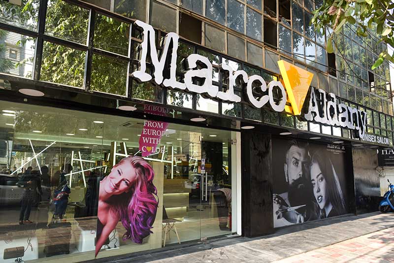
1. Create an immersive experience
Great retail design isn’t just about a well-curated display or attractive visual merchandising; it’s about the experience that you create using the various components of your store. When cooking up retail design ideas, make it a point to think about the big picture. What’s the overall experience that you’d like shoppers to have? What feelings do you want to evoke? The answers to these questions will help you craft retail designs that make a strong impression on your customers.
2. Set your layout based on the flow of traffic in-store
You want people to see your best and most enticing products or displays first, so you’ll need to know where they go or turn to when they enter your shop. Do they tend to move to the left or right? Where do their eyes go? These are just some of the questions you should ask when merchandising your store.
3. Create a focal point in all your displays
While it’s tempting to try to bring attention to anything and everything in your store, tried-and-tested design principles tell us that having just one focal point (preferably at eye level) is far more effective in drawing people in.
So whether you’re arranging your latest window display or setting up a new fixture in the middle of your store, be sure to design it with one focal point in mind. Pick one thing that you want to highlight, position it at eye level, and then strategically position other items and lights to bring attention to it.
4. Don’t put merchandise in the decompression zone
Avoid putting too many products or signs near your entrance (aka: the “decompression zone”). Shoppers in this part of the store likely still adjusting to the new environment, so they tend to miss any items or fixtures in this area.
5. Don’t overstuff the space
Have enough open space in your store so people can really appreciate your products, and move around without bumping into merchandise or other shoppers. Doing so will benefit you in two ways.

